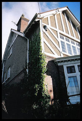
Out for a walk with my camera one day, I happened to walk past this lovely old building to see that it was empty with a 'sale agreed' board outside. I wasn't able to ascertain anything about the house itself - the date it was built or any previous history - but I did know that it used to be a care home.
It was a good enough opportunity to wander around and have a look close-up. I didn't intend to take any photos at first - just enjoyed exploring around the back and gardens, which were quite boring to be honest; only a patch of rough grass surrounded by a fence and a few trees - but there are some rather nice features at the front. So, before I knew it, I was clicking away!
The build date was probably around the 1930's due to the mock tudor style, pebble dash and the lovely stained glass leaded panels running along the top of the windows. The downstairs bay windows were also a popular design in housing built between the first and second world wars, when many building projects had begun as part of the 'Homes Fit For Heroes' schemes to provide better housing for those who had fought in the war and their families. This was the first attempt to clear slums and build more spacious housing at a national level. This house was probably out of the price range for many people but it would have made a rather nice home for a middle class or professional family.
A rather bland front porch entrance. The plain glass and the institutional 'no smoking' notice are signs of it's recent occupation. The original windows may well have included stained glass, as was usual with buildings of this style. I loved the light patches on the side wall though.
Above, a rather lovely tiled doorstep with a sweet arrangement of encroaching plants. The photo below shows the balcony above the front porch connecting the two gabled sections of the top floor.
Ivy growing on the side helps to soften some of the pebble dash, which it has in abundance! Although pebble dash was popular when built, it has since become rather passe, and looks quite bland in large areas with the original sandy colour. Having said that, it makes an interesting change in an area where there is none to little of it. I think I'd be very tempted to paint over it in a different colour though! ;) Although it does look nice with the white mock tudor beams at the front.
A garden escapee plant makes a nice image against the grey brick and weathered fencing.
Another image I particularly like is this one below, of an older styled dustbin, overgrown steps and peeled paint on the garden wall. And the photo below that shows more ivy, rampant vallerium and a twiddly-bit (aka curlicues) wrought-iron gate.
Now once again a residential house, it has been redecorated and the front garden landscaped, taking away that institutionalised look of the 'Health & Safety' regulated hand rails. An altogether rather lovely house.
A couple of photos showing the side elevation.


No comments:
Post a Comment